A single image flashes on your screen before the app loads. A shimmering spiral inside a hexagon. A pulse of Light behind Glass. You don’t think twice-but you Do Feel something: anticipation, curiosity, maybe a flicker of unease. These small symbols are doing more than marking software-they’re shaping how we relate to machines that learn.
We’re not just designing logos anymore. We’re crafting visual handshakes between humans and systems that can surprise us. And in that quiet moment before interaction begins, the Artificial intelligence Icon Has become a silent ambassador for an entire era of change.
Why the Symbol of Artificial Intelligence Matters More Than Ever
Symbols have always carried weight. Long before code existed, cave walls held drawings that meant Danger, Food, Home. Today, our minds still leap to meaning at a glance-red means stop, a bell means notification, a play button means motion. But Artificial intelligence Doesn’t move like a video. It doesn’t warn like a siren. Its actions unfold invisibly, across data streams and decision trees no one can fully trace.
That’s why the symbol matters so much now. Because when we can’t see the engine, we fixate on the hood ornament. The icon becomes the face of something formless. It gives us a place to project trust-or suspicion. A glowing orb might feel friendly. A jagged circuit pattern might feel cold. Neither tells the full story, but both shape expectations.
And those expectations matter. They influence whether someone clicks “analyze,” types a personal question, or shares medical history with an algorithm. The symbol is the First impression. It sets the tone for cooperation, hesitation, or awe.
What Does an AI Icon Actually Represent?
Let’s be honest: no one really knows what intelligence looks like. Not even neuroscientists can draw a clean picture of human thought. So how do we illustrate a machine version? We lean on metaphor. On echoes of biology, echoes of electricity, echoes of the unknown.
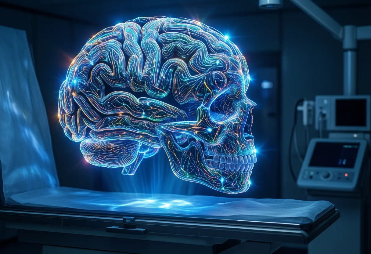
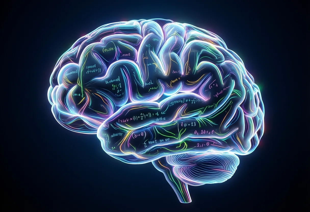
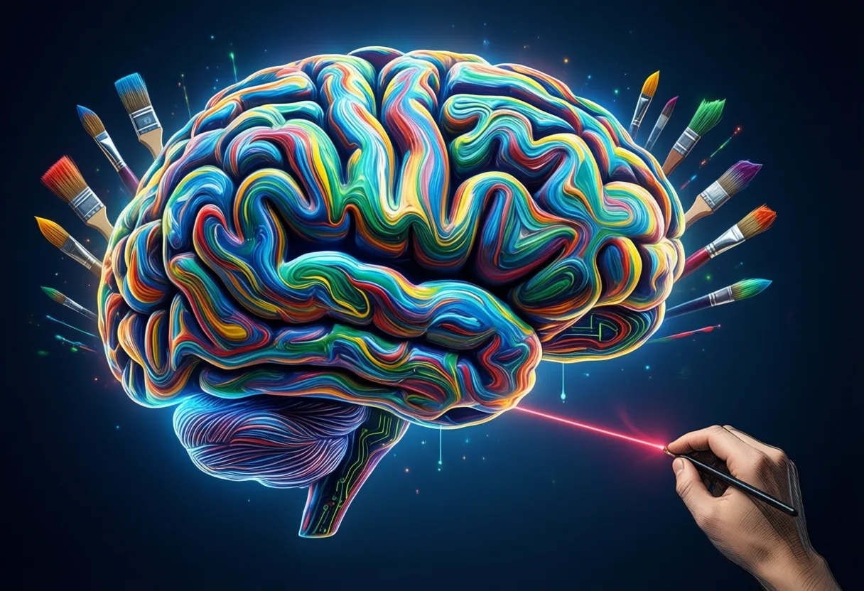
Some icons borrow from the brain-a soft neural web lit up like city lights at night. Others echo circuits, sharp lines branching like frozen lightning. Some go abstract: concentric rings suggesting growth, feedback, evolution. Each tries to say: This is not just code. This is learning.
But here’s the truth-we’re not drawing intelligence. We’re drawing Confidence. The icon doesn’t show reasoning. It shows readiness. It says: I am listening. I am processing. I will respond. That’s not a technical diagram. It’s a promise wrapped in geometry.
And users accept it. They tap the icon knowing it won’t explain how conclusions were reached-only that they Were Reached. The symbol stands in for transparency we don’t yet have.
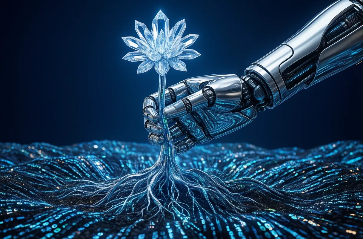
The Design Challenge: Capturing Intelligence Without a Face
Try this: sketch intelligence. Go ahead. No faces. No brains. No wires. Now make it fit in a circle smaller than your thumbnail. Suddenly, it’s not just design-it’s philosophy.
Designers wrestle with a core tension: make it familiar enough to trust, strange enough to signal novelty. Too human, and it feels deceptive. Too mechanical, and it feels unapproachable. The sweet spot? A balance where curiosity outweighs discomfort.
Consider symmetry. Many AI symbols use radial or bilateral balance-not because it’s pretty, but because it suggests order. Precision. Control. Even if the underlying system evolves unpredictably, the icon stays steady. It reassures. It says: Chaos is being managed.
And movement? Increasingly, icons aren’t static. A subtle glow. A rotating helix. A particle flow. These micro-animations suggest activity beneath the surface. Not unlike our own thoughts-quiet on the outside, swirling within.
Colors, Shapes, and Hidden Meanings
Color isn’t decoration. It’s direction. Blue dominates-not by accident. It carries decades of digital legacy: calm, clarity, connectivity. Think search bars, chat windows, health apps. When AI tools adopt blue, they borrow that legacy. They align themselves with help, not harm.
But green is rising. Associated with growth, adaptation, even life. Used carefully, it hints at systems that evolve-like ecosystems, not engines. Purple appears too, whispering mystery, creativity, the edge of known science.
Now shapes. Circles imply wholeness, continuity. Triangles point forward-progress, focus. Hexagons? Often used to suggest structure and efficiency, echoing honeycombs or molecular designs. Sharp angles feel fast, decisive. Curves feel inclusive, flowing.
And then there’s the absence of form. Negative space. A ring instead of a dot. An outline instead of a fill. These suggest openness, potential, the idea that intelligence isn’t contained-it’s emergent.
Together, these choices form a visual language. Not universal. Not perfect. But powerful.
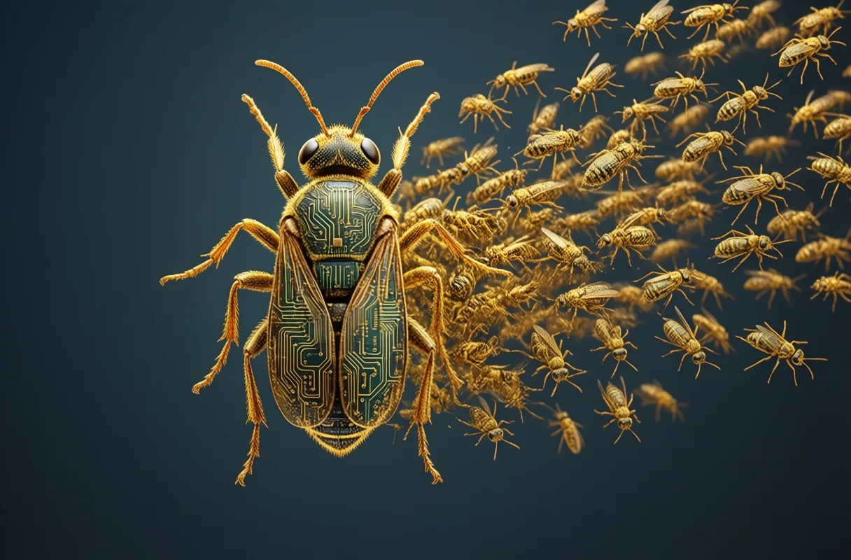
Beyond the Logo: Function Meets Philosophy
An icon isn’t just seen. It’s used. Tapped. Clicked. Swiped past. And every interaction layers meaning. If the tool delivers insight quickly, the symbol gains credibility. If it fails silently, the icon starts to feel hollow-even if the failure wasn’t its fault.
This is where function and symbolism collide. The same glowing node might represent a cancer-detection model in one hospital and a meme generator in another app store. Same shape. Vastly different stakes. Yet users bring similar assumptions: It knows something I don’t.
Designers are beginning to respond. Some interfaces now shift the icon slightly based on state-dimmed during processing, pulsing when ready, fractured when uncertain. These dynamic cues offer honesty. They admit: Not all answers are equal.
In doing so, they turn the icon into a kind of ethical compass. Not by words, but by behavior.
Misconceptions in the Machine: What the Icon Doesn’t Tell You
Here’s what the icon hides: effort. Complexity. Limits. That smooth gradient? Hides thousands of hours debugging. That elegant loop? Represents trade-offs between speed and accuracy no user sees.
Worse, the icon can imply omniscience. A shining sphere might look all-knowing. But most AI today is narrow. Trained on specific data. Blind outside its domain. The icon doesn’t warn you when it’s guessing. Or when it’s repeating biases baked into old datasets.
It also doesn’t show dependency. That smart assistant relies on servers, energy grids, underpaid moderators, rare earth metals. The icon floats free of supply chains and carbon costs.
And perhaps most dangerously, it can aestheticize risk. Make surveillance feel sleek. Turn automation into art. A beautiful interface shouldn’t sanitize consequences.
The icon isn’t lying. It’s simplifying. But in a world where decisions affect lives, simplicity can be misleading.
Context Is Key: Where These Symbols Live and Why It Matters
Drop the same AI icon into three places: a child’s learning app, a financial trading dashboard, a mental health chatbot. The shape may be identical, but the weight shifts dramatically.
In education, the symbol might carry hope-a tutor that never tires. In finance, it whispers power-and danger. One misread pattern, one flawed prediction, and markets tremble. In healthcare, it holds breath. A diagnosis. A recommendation. A second opinion from code.
Location changes everything. On a phone, it’s casual. On a hospital wall, it’s solemn. On a factory floor, it’s functional. The same design takes on new meaning based on where it appears and who approaches it.
Even size matters. Large, it commands attention. Small, it fades into routine. Over time, frequent exposure dulls impact. The revolutionary becomes mundane. Which might be progress-or complacency.
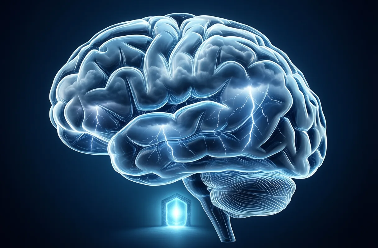
Practical Takeaways for Designers and Innovators
So what do we do with this power? How do we design symbols that serve, not seduce?
First: Design for humility. Let the icon acknowledge limits. Use asymmetry. Introduce slight imperfections. Avoid over-polished perfection-it implies infallibility.
Second: Embrace context-aware visuals. Allow the symbol to adapt-slightly-to its environment. A warmer tone in care settings. A sharper edge in technical tools. Let form follow function, not fashion.
Third: Animate with intention. Movement should communicate status, not just style. A slow pulse during thinking. A color shift when uncertain. Transparency through motion.
And finally: involve users. Not just in testing, but in naming, shaping, interpreting. Let communities co-create meaning. Because an icon only works if it’s understood-not just seen.
The Lasting Imprint of a Digital Age Symbol
Years from now, we may look back at these early icons as artifacts of a turning point. Not because they were perfect, but because they marked the moment we began negotiating with machines that learn.
They weren’t just labels. They were invitations. Warnings. Promises. Tiny doorways into systems reshaping work, medicine, creativity, war.
And like all symbols, they evolved alongside us. Responding to fear. Reflecting hope. Absorbing blame. Sharing credit.
One day, the current designs may seem naive-like steam trains drawn on 19th-century postcards. But they served their purpose. They helped us see the invisible. Reach toward the intangible. Trust, cautiously, in something we’re still learning to understand.
Until then, we keep drawing. Not the future. Just its shadow.
The Symbol That Speaks Volumes
More Than Just a Circuit Pattern
Ever noticed how often a glowing brain or a geometric head pops up when someone talks about artificial intelligence? That image-often a sleek, stylized silhouette filled with circuit-like lines or digital fragments-isn’t just eye candy. It’s become the go-to visual shorthand for AI, recognized even by people who’ve never coded a line. Designers lean on this icon because it bridges the abstract (machine learning, neural networks) with something familiar: human thought. The blend of organic shape and tech elements hints at machines mimicking minds, making the invisible feel tangible.
A Shape-Shifting Standard
Here’s a fun twist: there’s no official AI logo. Unlike traffic signs or brand mascots, this symbol evolved organically across tech companies, media, and presentations. Some versions look like neurons firing, others resemble microchips wearing a thinking cap. Despite the variations, they share DNA-symmetry, light effects, cool-toned colors-all aiming to convey intelligence without feeling cold or robotic. It’s rare for a concept as complex as AI to settle on such a consistent visual language without any central authority calling the shots.
Why It Sticks
The reason this icon works so well? It taps into how we imagine smart machines-not as clunky robots, but as silent, fast processors working behind the scenes. You’ll spot it in apps predicting your next song, tools drafting emails, or systems spotting fraud. Because it’s simple and scalable, it fits neatly on a phone screen or blown up on a conference banner. And while trends come and go, this particular blend of mind and machine continues to signal what’s next-proving that sometimes, the best way to represent the future is with a symbol that feels both familiar and forward-looking.
Frequently Asked Questions
Why are artificial intelligence icons important in technology design?
AI icons shape how people relate to learning systems by serving as visual handshakes between humans and machines. They set the tone for trust, hesitation, or curiosity before any interaction occurs.
What do artificial intelligence icons actually represent?
AI icons represent readiness and the promise of response, not actual reasoning. They use metaphors like neural webs, circuits, or abstract patterns to suggest learning and intelligence.
How do colors and shapes influence the meaning of AI icons?
Colors like blue suggest calm and connectivity, while green implies growth and adaptation. Shapes such as circles suggest continuity, triangles indicate progress, and hexagons imply structure and efficiency.
Can the same AI icon have different meanings in different contexts?
Yes, the same AI icon can carry hope in education, signal power and danger in finance, and hold solemn weight in healthcare. Its meaning shifts based on location, user, and application.
This article was produced with AI assistance. How Neuron Magazine uses AI.
Saoirse investigates how automation, remote systems, and AI reshape labor, careers, and human purpose. She centers worker voices and cultural change, blending data with narrative depth to reveal what the future feels like on the ground.